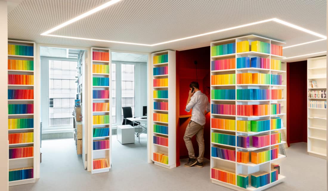
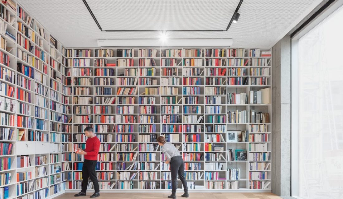
 The renowned German publishing house Suhrkamp was looking for a spatial concept that would reflect the publisher’s identity. The project in Berlin called for a tailor-made solution that would be simple and elegant and which would fit 135 employees and thousands of books.
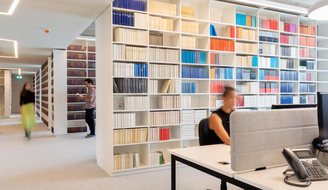
 Kinzo’s vision was a house, which rests on multi-story high stacked books instead of walls and columns. Accordingly, shelves had to fill almost every free space on the walls while simultaneously replacing them. Kinzo let the walls meander through the 6 floors of the building, like an inner facade. This idea not only created more wall space and thus sufficient shelf space on close to 5 linear kilometers, but at the same time optimised the area of the rooms and created small niches – usable for all employees as retreat rooms for spontaneous meetings, communication islands, think tanks or telephone booths.
 Kinzo not only made it possible to integrate all the books and shelves into the space, but also to create a space that was both tailored to the different requirements of the users and flexible at the same time allowing colleagues to work across rooms with natural communication at eye level. Although high-quality materials and products were used and many fixtures had to be custom-made, the solutions remained cost-effective and within budget. Kinzo successfully met the requirements and needs of an institution of high culture that now presents itself with a fresh face.
Architecture by Bundschuh, Photography by Schnepp Renou & Sebastian Dörken


