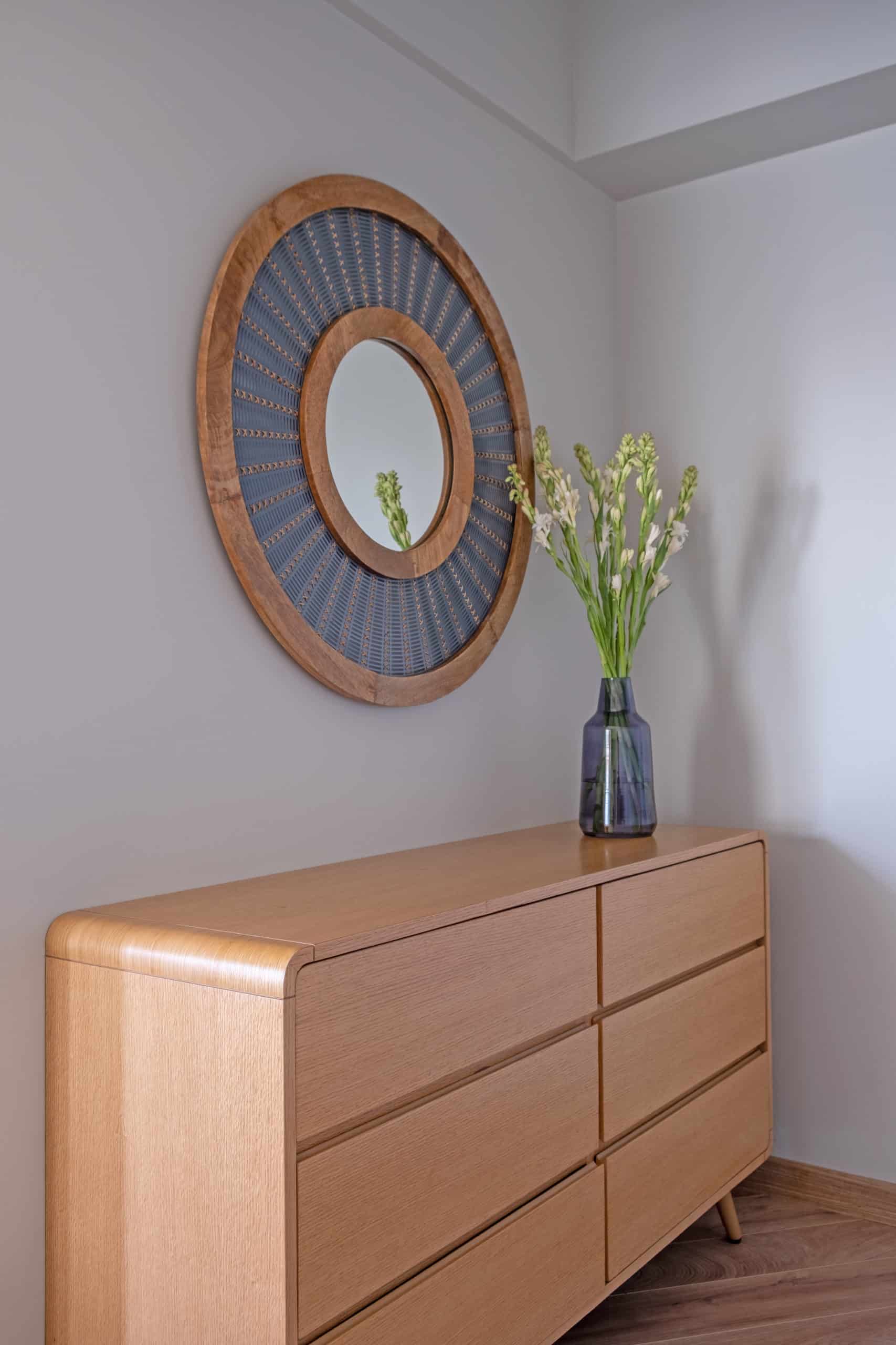
Mumbai-based interior design firm Quirk Studio by Disha Bhavsar and Shivani Ajmera delivered a residential project called ‘The Jardin Home’.
Taking a minimalistic approach was the key to design this large residence in the lush Juhu suburb of Mumbai, in order to create the perfect balance of modern, comfortable and elegant. Designed as a getaway home for a Gujarat based family, the home is permanently inhabited by the client’s son, who works in the city. The design has been tailored to suit the client’s desired contemporary style while adhering to a concise brief: A pleasant and modish place, fit for a bachelor, the home doubles up as a warm retreat for the entire family as and when they visit. Another important design factor is the Vaastu-compliance of planning, which was also driven by the belief of the client and was therefore integrated into the planning principles. Hence, the entire façade is panelled with mirrors, and plants are added to the space.
Adopting a nature-inspired design approach, the design has been defined by incorporating shades of blue and green. The natural blend of neutral and monochromatic palettes exudes a sense of calmness and well-being within the home. Accent furniture pieces add to the overall drama and vibe of the space. With the intention of allowing an influx of natural light, large casement windows have been installed throughout the house.
The house opens into a spacious living room that flawlessly transitions into the dining area. The distinct colours of the décor and furniture, complement the entire appearance of the space; an evocative abstract rug is paired with a minimalistic grey sofa that accentuates the soft luxe feeling. Similarly, the teal blue upholstered armchair brings a sense of serenity and zen-like aesthetic to the space, while creating an exciting visual dichotomy that is in sync with the muted interiors. The combination of distinct elements such as coffee tables from Gulmohar Lane, and furniture that is crafted in metal, marble, and wood, create an intricate interplay of textures.
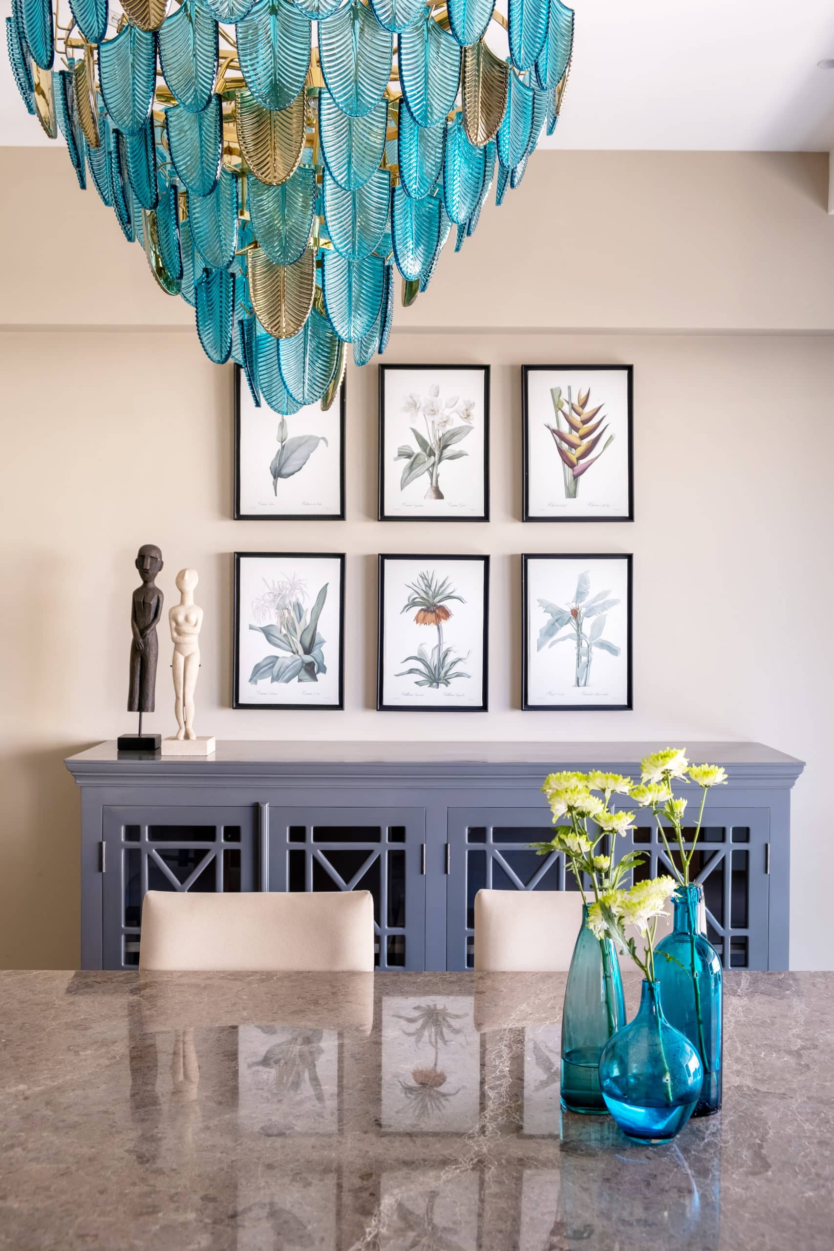
The focal point of the dining space is undoubtedly the ornate chandelier that is dominated by aqua and gold-coloured leaves. The chandelier imparts a harmonious essence by adding character to the open space. The floral wall-art that comprises botanical prints and the customised sideboard adds to the liveliness of the area.
The kitchen is seamlessly connected with the dining and living area by a sliding door, creating a continuity with the open layout of the space. Designed with simplicity, the kitchen is made using a simple back-painted glass with rose gold cabinet handles. The modular design maximises the storage space within a relatively compact area and increases the functionality inside the kitchen itself.
The merging of two rooms has been enabled to create a larger, expansive Master Suite that radiates opulence, modernity and comfort with its plush, grey interiors. Considering that the room is occupied by the client’s son, it was imperative to create a zone that resonates with a young working professional, crafting a more casual and relaxed environment. Hence, the Master Suite has a modern look and feel and serves as a bachelor pad of sorts. The wall has a lime plaster finish and a hidden walk-in closet within its panelling, allowing for a clutter-free zone. Diagonal oak flooring is used to amplify the cosy environs while adding colour and warmth to the bedroom.
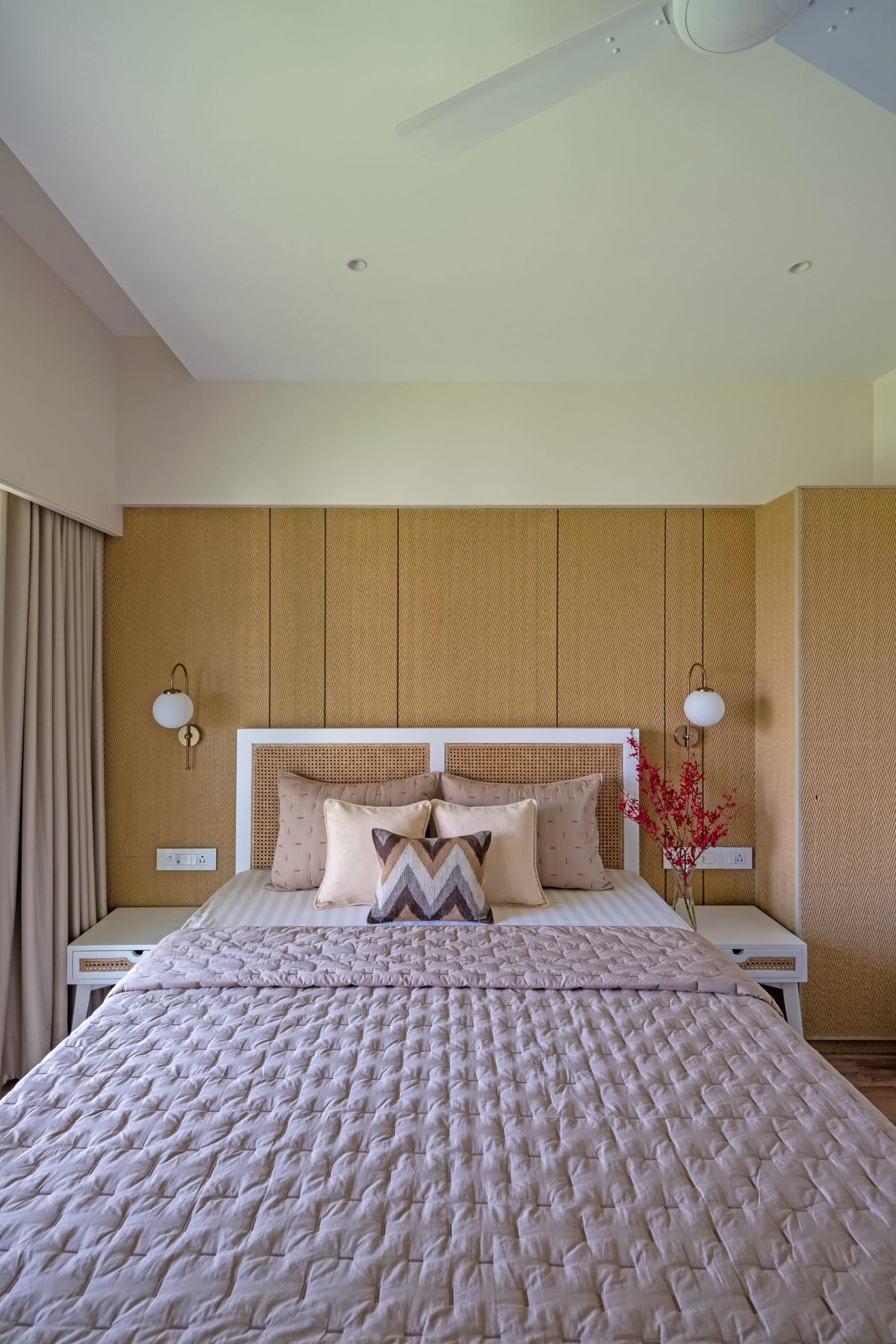
The parent’s bedroom, in contrast to the Master Suite, is more gracious and congenial, as driven by the brief of a welcoming design feel. The bright interiors match the choice of furniture and décor inside the room. The panelling behind the bed offsets the white rattan furniture. The parent’s suite is topped off with oak flooring, making the bedroom a comfortable and restful environment for the parents who visit occasionally.
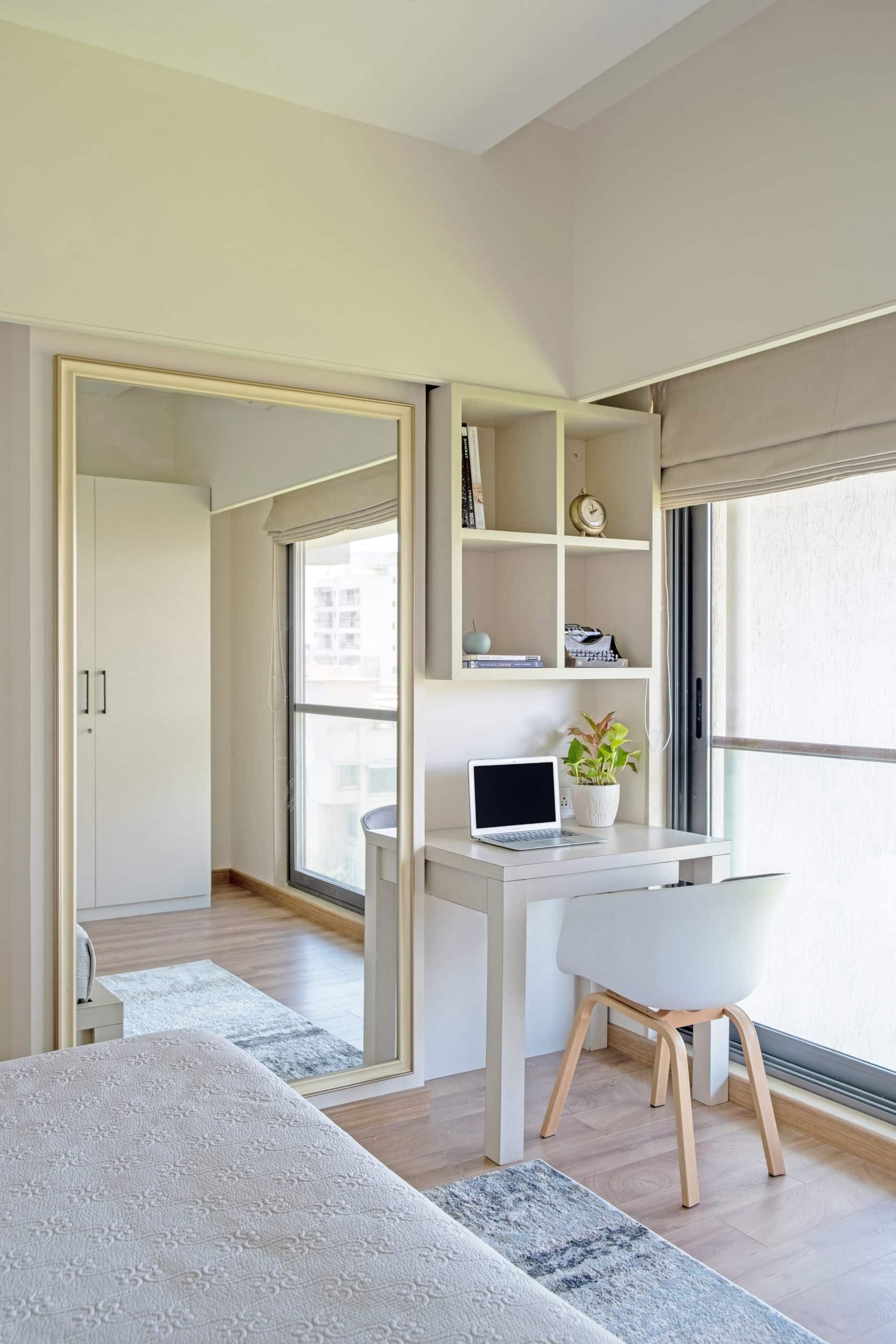
The use of subtle interiors is applied to the guest room, wherein the furniture is repurposed and paired with neutral tones. Cherry blossom wallpaper in the hues of grey and white adds a dynamic play to continue the nature-based theme.


