 ACDF Architecture, a firm renowned for its use of anamorphic patterns and unusual juxtapositions of materials, is proud to unveil the new offices of Autodesk, situated in the trendy district of Griffintown, bordering downtown Montreal. The 40,360 sf project, comprising two floors of an existing office building, houses 200 Autodesk employees and features a series of offices, meeting rooms, breakout spaces, a game room, a media gallery, and multi-functional event spaces.
Tasked with creating a more branded space for the Montreal operations of the globally-renowned company, ACDF drew from within to bring 3D objects from Autodesk’s software programs to life, ensuring maximal workspace efficiency and capturing the essence of the company’s products and people.
“It’s always challenging to design with strict spatial requirements within an existing framework,” notes Veronica Lalli, architect and project manager at ACDF. “We were able to meet all of the needs through the strategic placement of objects, using contrasts in colour and form.”
In approaching the Autodesk project, ACDF focused on being as sustainable as possible in terms of preserving as many of the space’s existing structural elements as they could. The space was scanned in 3D and, using Autodesk’s powerful Revit program, the team conducted in-depth studies of every existing room. By identifying spaces with compatible qualities, ACDF was able to minimise the demolition process. The firm endeavoured to preserve partitions that still offered value, while leveraging portions of existing polished concrete floors and white ceilings as a base for their material palette.
“We made some of the existing spaces work for them, and then we designed some new spaces that are the heart and soul of the project,” explains Lalli. “For instance, we were able to preserve a large portion of the enclosed rooms on the main floor, which now serves as their services block, addressing their needs in the space.”
Autodesk wanted its services block to be the central anchor of the office’s public space, with numerous informal lounges, whiteboard walls, presentation spaces, and entertainment facilities designed for hosting events surrounding it. In order to create separation between the level’s public spaces and private offices, ACDF added layers of film and branding patterns to the existing window glaze of the latter, ensuring privacy without severing the flow of diffused natural light.
Conceptually, ACDF’s notion of using of forms and colours was inspired by the core of Autodesk itself. Returning to the company’s flagship product, AutoCad, and the computer-aided design system, they embraced the concept of generating architectural shapes, and then morphing them to create volumes using control points and Autodesk ‘digital modifying commands’. That concept unfolds immediately upon arrival on the 3rd floor of the new offices, where the elevator door serves as a gateway into the reception zone, delineated by black glass finishes, shiny epoxy flooring, a branded backlit screen, and a life-size display screen.
The black ‘scenographic spine’ frames a contrasting white corridor, flanked to the left by a wall of Autodesk working images, and to the right by the frosted glass of the public conference room. The short corridor leads into a gaping purple star, developed through Autodesk software, fitted through edge modifications and control point adjustments, and then built to be larger than life.
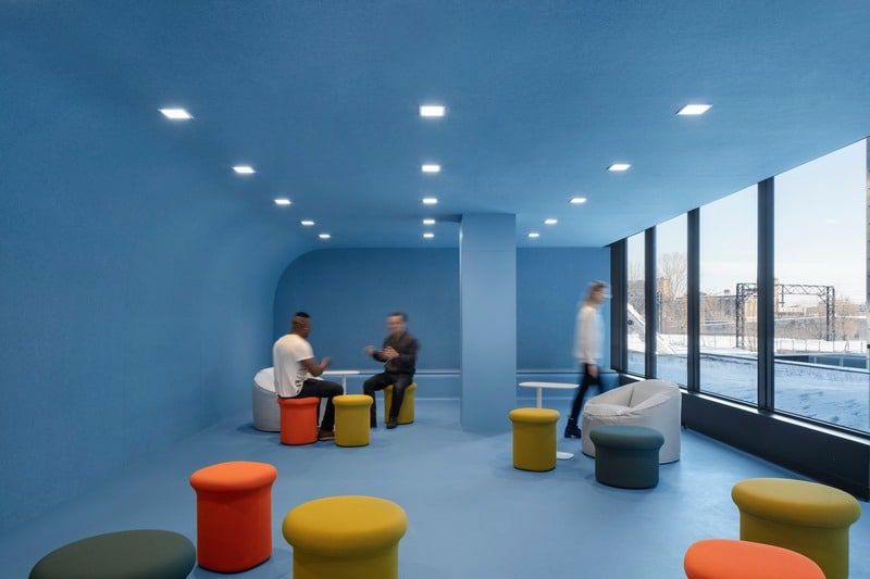
Each delineated space has a particular function, with the purple star housing a media gallery to display a wide array of Autodesk’s work, while also serving as a passageway to a multifunctional presentation zone featuring bleachers and a projection screen. In the bleacher zone, an integrated kitchenette and bar enhance the facilities for hosting public events, while a more formal kitchen provides access to an outdoor terrace. While the main kitchen area already existed, ACDF extended it with a hyper-acoustic new game room defined by its abundant natural light and its filleted geometry, creating colourful geometric seating and rounded blue walls and ceiling.
Colourful geometric efficiency
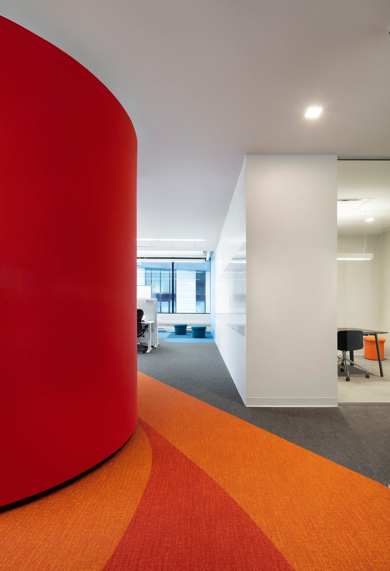
Each corridor leads to a different object and colour scheme, with six colour zones in total spread across the two floors.
“The idea was to create a flowing space where, in any corridor, you can turn to objects and colours to reference where you are,” explains Lalli. “We didn’t want people to find themselves in an unrecognisable spot on the floor plan, not being able to situate themselves, which is something that often happens in open layout offices.”
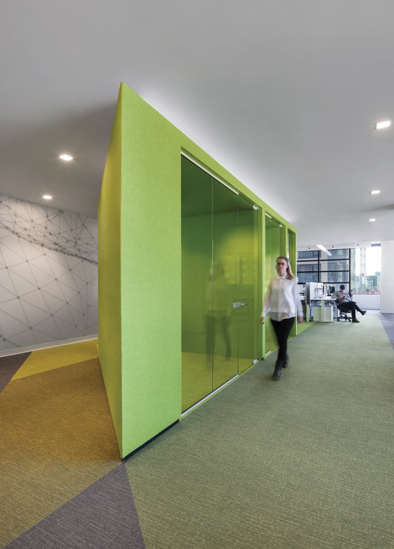
On the second level, ACDF’s focus shifted to operational efficiency for the bulk of the company’s day-to-day operations. Functionally, Autodesk employees work in small groups and require lots of breakout zones. The firm once again played with geometrical shapes and forms to develop a series of pods that would break up the wide-open space. The strategically placed pods define a series of intimate zones, while maintaining the concept of an open space. Each zone is like an individual neighbourhood, identified uniquely by a shape and colour, and deriving its name from the object that defines it. Carpeting provides a sort of rippling effect, as if each unique object was dropped into the space, with colour patterns that denote transitions from one zone to the next as a wayfinding principle.
To complete the functional separation of each space from its adjacent neighbourhood, and from the surrounding enclosed offices, finishing touches include acoustic natural wool felt wrapped around each geometric pod, resulting in snug casual meeting nooks around the pods. ACDF was able to further isolate the sound of each zone through the preservation of some existing acoustic ceiling tiles, and with the addition of carpeting.
“We were able to create a series of multifunctional spaces that address the client’s needs, while wrapping them in the embrace of a larger branded space,” concludes Veronica Lalli. “Collectively, the spaces capture the essence of what Autodesk is all about.”


