Nissan’s brand identity has always reflected the meaning of the company name. Indeed, in Japanese characters, “Nissan” can translate as “sun product” or “birth of the sun” – giving rise to the now-famous brand logo that boasts more than 80 years of automotive history. But how did this it evolve from its humble origins into the globally-recognised motif seen today?
Birth of the brand logo
The story starts back in the 1930’s. Dreaming of creating a strong Japanese auto brand, Yoshisuke Aikawa merged his holding Tobata Foundry Co., Ltd. with Nihon Sangyo and Dat Motorcar Co. (whose predecessor started producing DAT cars back in 1914) Together, this unified company was renamed NISSAN – selling cars badged under both the Datsun and Nissan names.
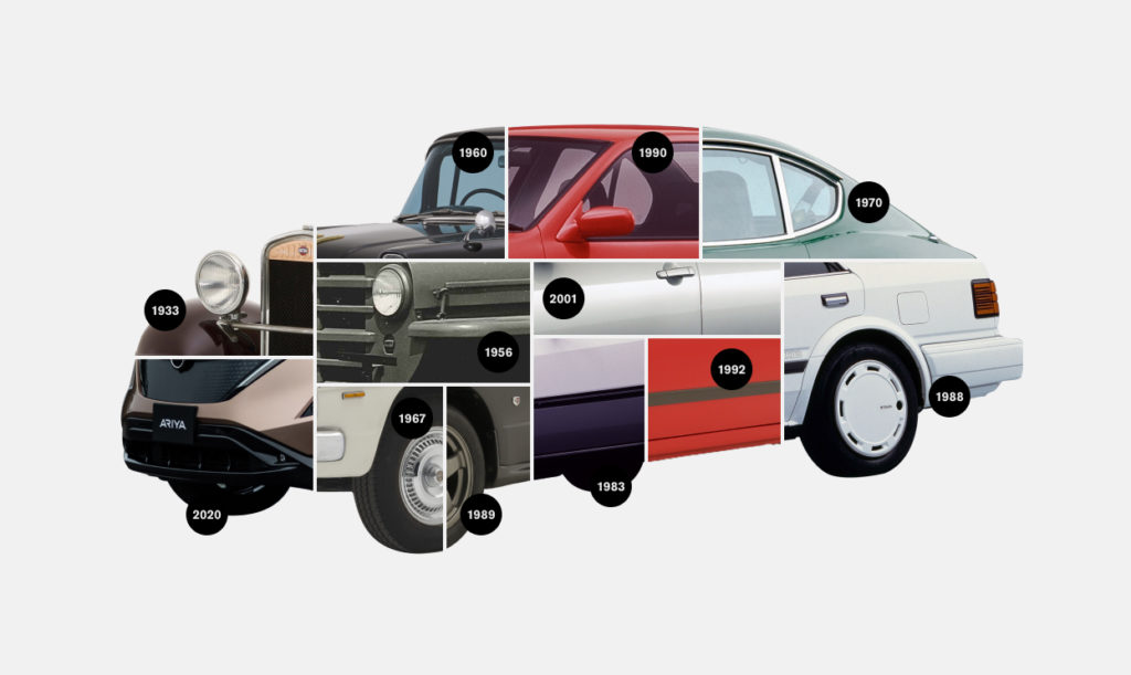
This is what gave birth to Nissan’s first brand logo in 1933. Inherited from the Datsun design (see interactive image), it utilised the same style of emblem motif, featuring a blue rectangle with the brand name inscribed in white letters, together with a red circle in the background which symbolised “a rising sun”.
Professor David Bihanic, Designer and Lecturer at the University of Sorbonne, in Paris, is an expert on graphic symbolism. He confirms this first brand logo is immediately emblematic of the brand’s Japanese roots, synonymous with the red disc on flag of Japan.
Used as Nissan’s visual identity throughout the 1930’s, this first brand logo was immediately iconic – lasting right through until 1970! And despite 4 revisions since, each brand logo has always retained its integral link to the company’s heritage and culture.
Brand logo vs badges on vehicles
However, if you take a look at Nissan cars themselves through these decades, you might find the official brand logo hard to spot. Instead, you’ll find a whole range of other Nissan badges, in many different graphic styles, representing the Nissan name.
Why? Because as vehicle design evolved, automakers wanted brand badges on cars to reflect their name in contemporary styles, separate to the more stable, traditional brand logo.
Mid-Century Nissan badges
Some of the best examples of this are Nissan badges in the mid-20th century. Formal, capitalised “NISSAN” badges were commonplace in the 1950’s, while the 60’s saw these replaced with italic typefaces. This change gave a sense of motion in a time of burgeoning car ownership and more personal freedom, while the more informal touch also nods to liberalising attitudes – with the 1960 logo even dropping the capital N!
Bold, brash, but misaligned
The following decades then saw a return to capital letters on Nissan car badges as trends shifted towards the brash, business-focused 80’s. This was an era of individual status and making a statement – giving rise to a number of flash metallic badges with heavy-type faces. Often these differed from region to region, and even from model to model.
Age of Modern Industry
Yet it soon became clear that to have a strong global brand presence, Nissan needed a unified visual identity for the millennium. Featuring a metallic monochrome design, the 2001 brand logo was created as a symbol of modern industry that would also be worn on everyvehicle, eliminating the practice of different badges for each model.
Professor Bihanic explains that the industrial-style design seen in the 2001 update became “common to almost all car manufacturers:3-D extrusion or light volume (bas-relief) and metallic grey giving a shadow or reflection effect” – as each clamoured to portray a vision of advanced manufacturing.

Into the future
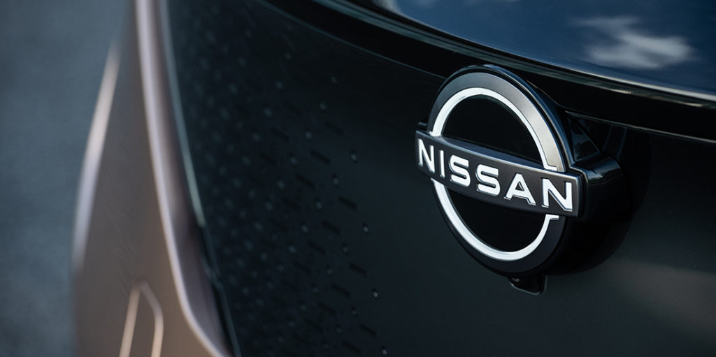
As we enter the 2020s, the industrial age gives way to the electric. To mark this, Nissan unveiled a new, simplified logo, worn with pride on the front of the all-new zero-emissions Nissan Ariya. The new brand logo adopts a sleeker, single-colour “flat” 2-D format, with thinner lines and sharper definition. Representing a new era of seamless, intuitive and electrified mobility, it’s also adapted for the smartphone age, where clean graphics stand out on pocket screens.
Even so, heritage is not forgotten, thanks to the familiar sun disc shape with the Nissan name through the centre. Tsutomu Matsuo, deputy general manager of Nissan’s advanced design department, reveals, “the new Nissan logo communicates our guiding message, carried over from past iterations: If you have a strong, determined belief, it can even penetrate the sun.”
Analysis of 2020 logo
Changing the most visible aspect of a brand’s identity is always a big step. Professor Bihanic explains while a logo will ”inevitably change, transform, mutate in order to match the new moods of the present day”, its leading recognisable graphics must be carried over to preserve “the DNA of a brand” and stand the test of time. He affirms “This part of the identity must never be seen to give way, or be interrupted when updating a visual identity – except to signal a radical change in management or in the direction of the company.”
For this reason, Nissan’s 2020 brand logo is an evolution, rather than an entirely new incarnation. It speaks to an ongoing journey Nissan is making towards a zero-emissions world through Nissan Intelligent Mobility, while retaining its spirit of innovation and heritage. It’s pleasing to see Professor Bihanic agrees, as he concludes “this is the strong sign of a brand which, while bearing witness to its history, is now more fully open to the future than ever before.” And better still, it will be worn by Nissan vehicles the world over.


