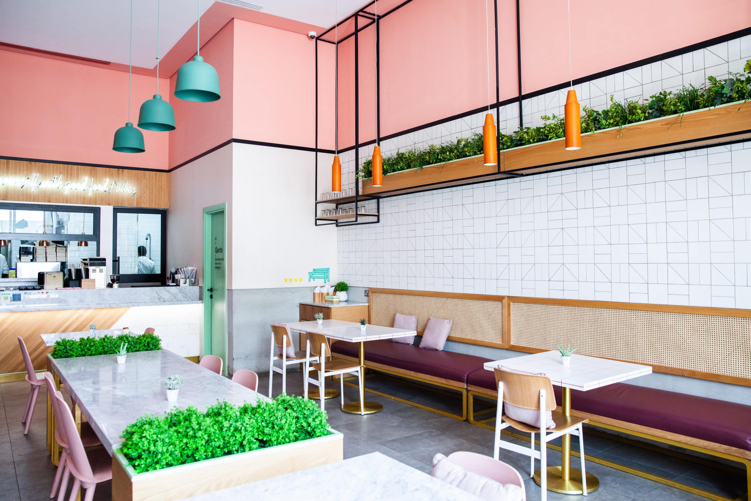
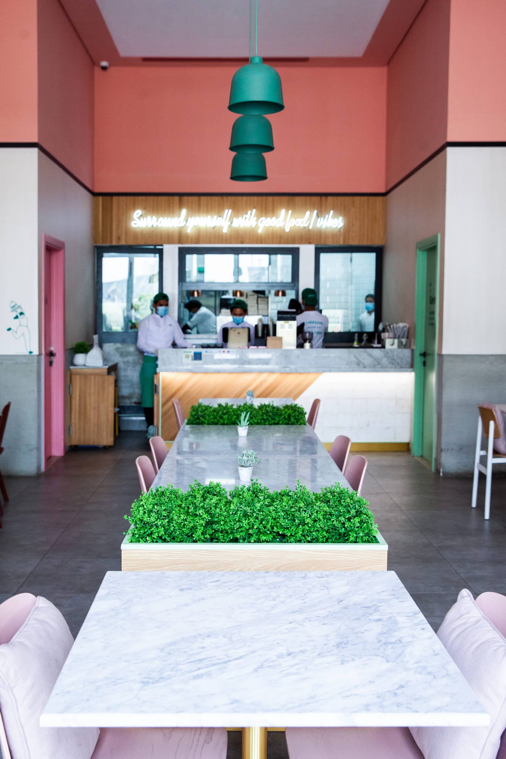
 H2R Design created a fun and playful space called Surround in Riyadh with sophistication for the foodies of Riyadh to gather, have great food, and to really celebrate life together. Primarily a chic burger joint, with other indulgent quality foods, the interior design of Surround is colourful, vibrant and an engaging space full of quirky design features which displays the character of the space.
H2R Design worked closely with the client to execute their vision for Surround which resulted in the minimal yet playful restaurant inspiring the sense of community.
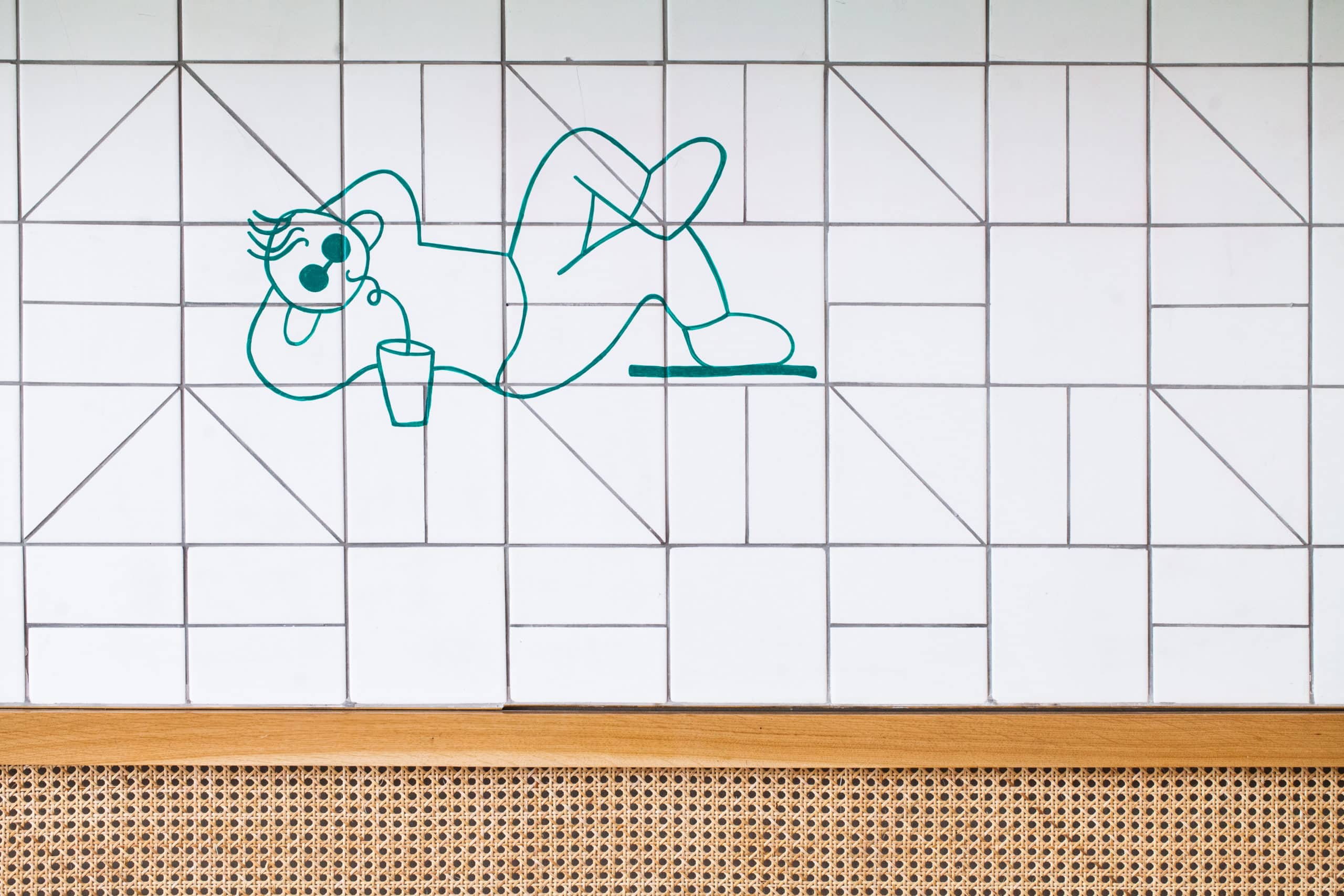
 “We focussed on making Surround a spirited ‘playground’ for adults, whilst retaining the elegant side. This can be seen in the wall grid, taking us back to school graph paper, with quirky sketches and ‘doodles’ that create a nostalgic language. As there is so much boldness on the higher level of the space with pink taking prominence, we wanted to keep it quite cool and neutral as we worked our way down”, explained Hasan Roomi, co-founder of H2R Design.
“Our methodology was to combine the different ways of harmonising the playfulness with the cultured. We didn’t want to scare people off by being too childlike, and we didn’t want it to feel too sophisticated either. The pink perimeter paint was initially alarming for the client, as it was so protruding. But once all the other materials and furniture coalesced, they loved it! As designers, we always have to remind everyone to be patient until the end, to really see the design as one holistic experience and to believe in it,” Husain Roomi, co-founder of H2R Design continued.
 The interior design features distinct use of materials and unusual amalgamations. For example, concrete micro topping was incorporated as a neutral canvas, and the space was built up with different tiles, marble and white, cut in different shapes and angles. Brave colours in the furniture on the higher level form the sense of boldness and fun, while the use of wood and rattan add a bit of temperateness.
The bold colours were influenced by the original branding, in pinks and greens. H2R Design aimed to develop the identity of Surround holistically between the brand identity and the location. The space encourages each visitor to use it differently, as if it were an adult ‘recess’ area where guests can sit in a big group, as a pair or as an individual.
The colours in the furniture portray a fresh feeling with variations of pinks and greens to reflect the branding. These assortments of colours are highlighted throughout the furniture and fabrics, the grouting on the tabletops, and the wall finishes as a datum.- Diners will discover quirky doodles playing on the school for kids’ nostalgic references. The stencil doodles throughout the space engage the guests and remind them of the fun and playfulness they once had at school.
Diners will discover quirky doodles playing on the school for kids’ nostalgic references. The stencil doodles throughout the space engage the guests and remind them of the fun and playfulness they once had at school.


